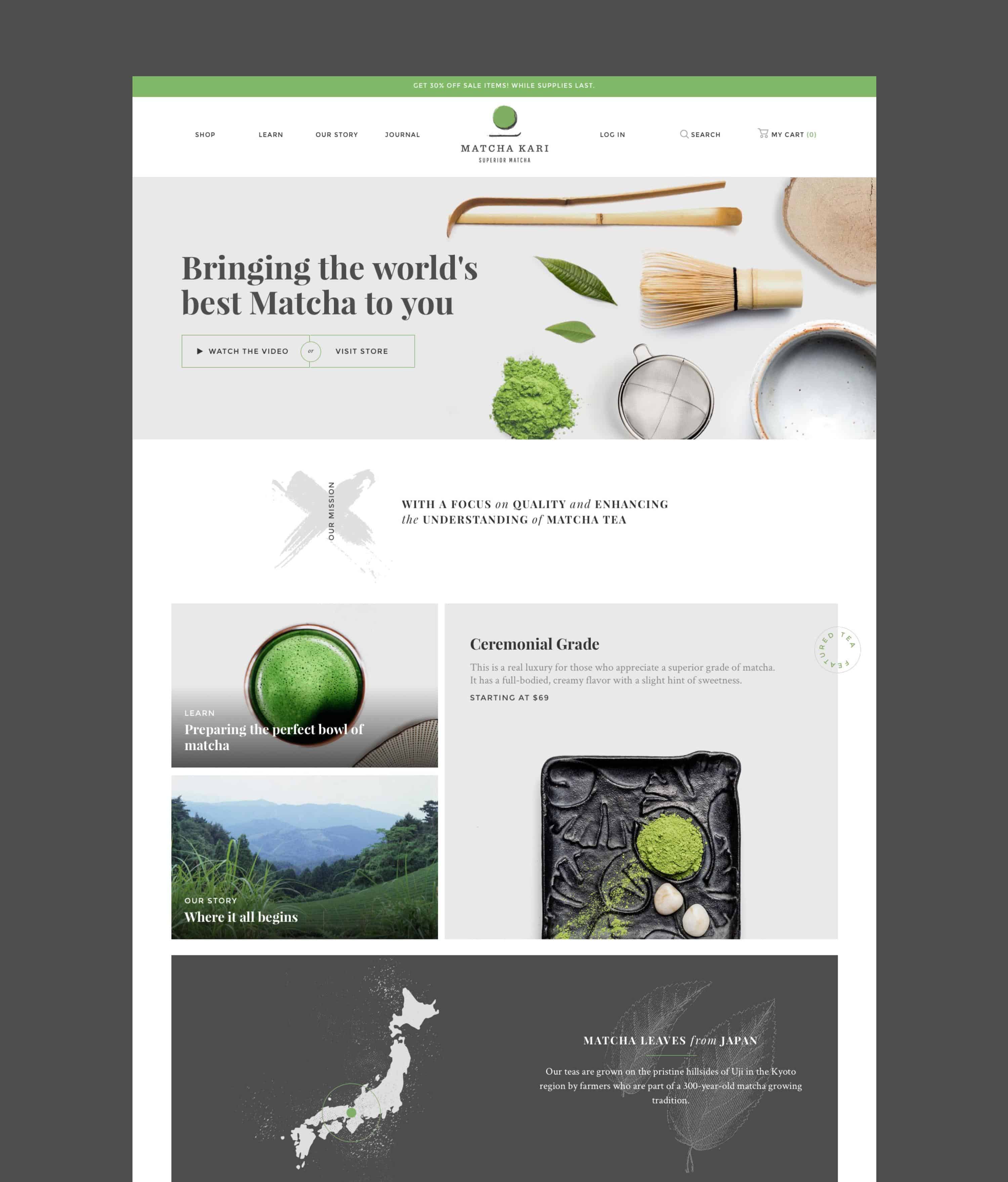
The founders of Matcha Kari came to us with just a domain name. A good one: matcha.com. Having scored such a URL, we knew the site – and brand – needed to be top notch. We began with creating the brand, which is minimal with a Japanese inspired brush-stroked icon of a matcha bowl and spoon. Next came the packaging for the tea, and following that, lifestyle and product photo shoots to provide us with high-end imagery for the website.
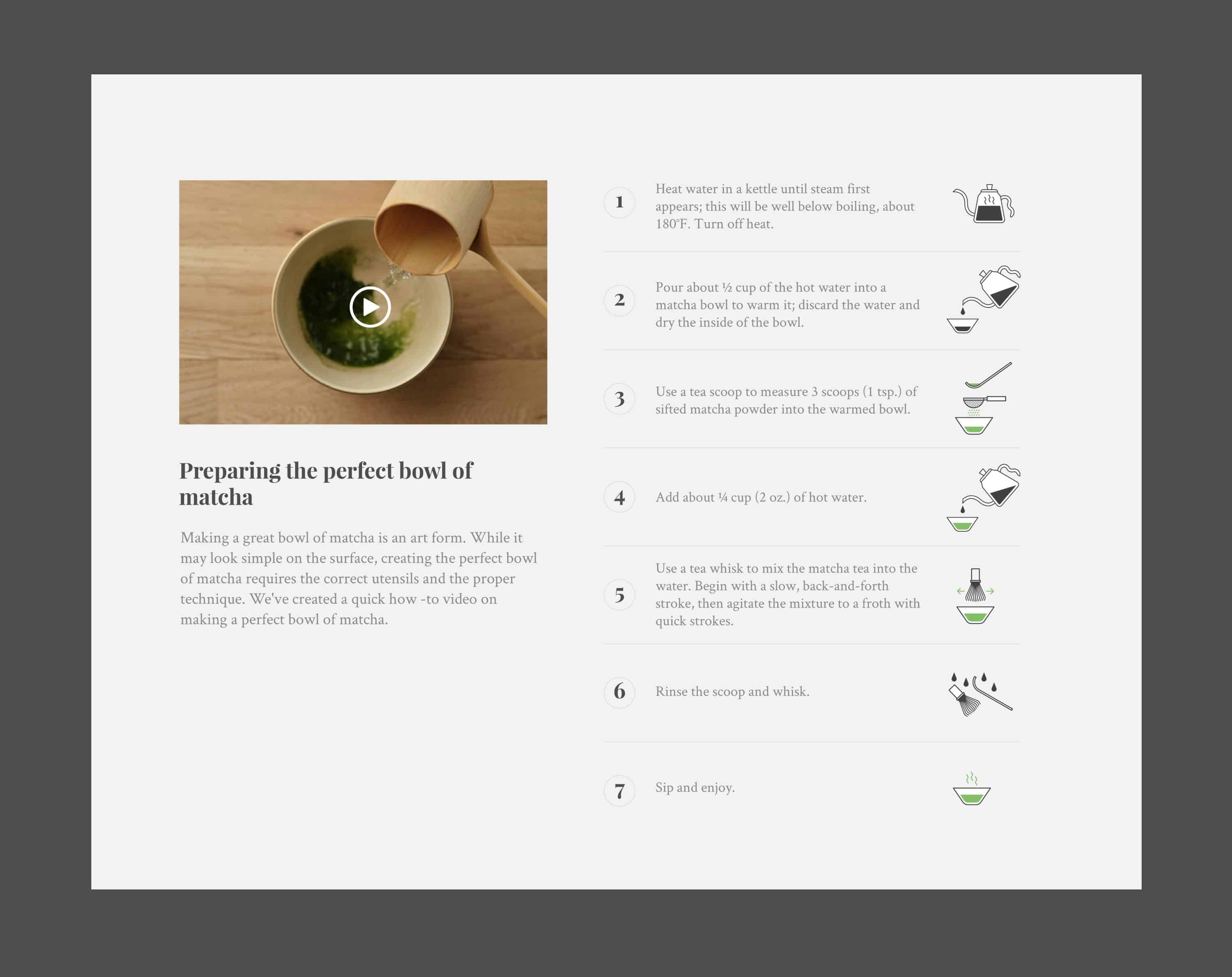
The ecommerce website was created to sell tea, of course, but also to educate the customer about the product. Our solution was to create an extensive learning page full of information on matcha history, processing, use, and health benefits. All of the effort Matcha Kari puts into its learning page and blog serves to support their mission, boost their SEO rankings, and cultivate a following of matcha lovers. With a beautiful brand, quality products, and robust ecommerce website, Matcha Kari has now become the place to purchase matcha tea online.
Scope
- Strategy
- Branding
- Packaging
- Illustration
- Photo / Video Art Direction
- Web Design
- Web Development
- Ecommerce