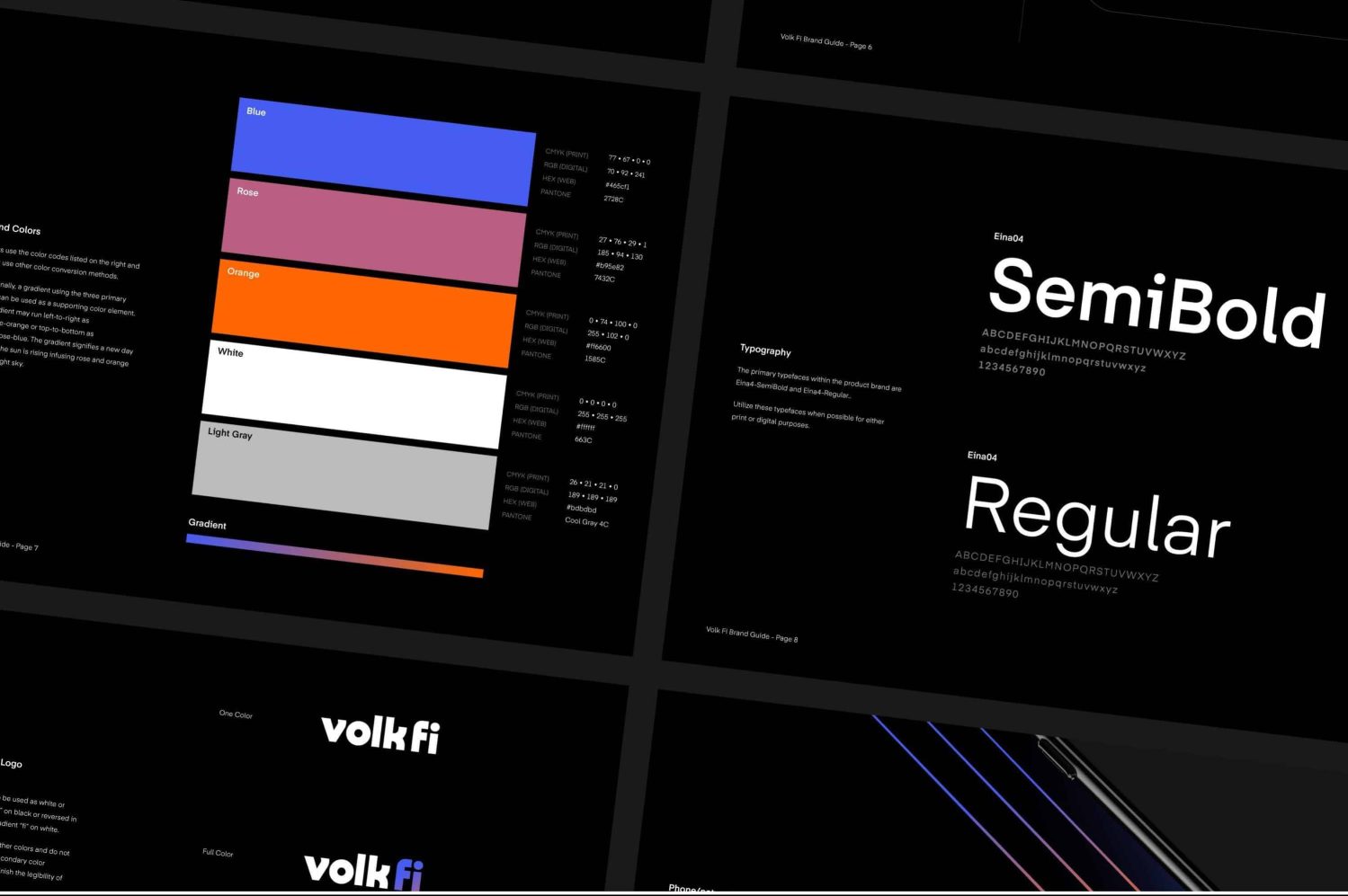
Volk Wireless is a startup company with the belief that when wireless is intelligently applied, the whole world can have an affordable, reliable network. Volk came to us looking to solidify a branding strategy that spoke to both the overarching company and current products as well as guidance for future products. We established a logo system, then moved to the complex task of explaining such a new concept in networking and cell phone carrier services.
With the visual brand, we took our inspiration from the 80s when the technology we love today was in its infancy. We aimed to capture the excitement of the new possibilities it opened through a nostalgic look while also modernizing it enough to fit a forward-looking company. Logos for VolkFi and Volk1 feature rounded, bold lettering with a gradient treatment on the text pairing with “Volk”. An additional supporting element is a set of three equally spaced lines indicating the power of a long-range scalable network that has a subtle glow that changes to a stronger color when meeting or overlapping.
Scope
- Strategy
- Branding
- Illustration
- Web Design
- Web Development


