One of the key tenets of Truera’s product is that they are seeking to remove what has been labeled the “black box” of machine learning — data went in, data came out, but no one really knew what was happening in between. As we worked on their logo design, we aimed for a subtle nod to the box concept, placing an open box within the “t”. We also focused on using color to provide pronunciation cues. By separating the logo text through a color break, viewers could see that while it was one name, it pronounces as though two — “true”, “era”. By electing to use this route rather than changing fonts, capitalization, or letter stacking, it set the brand up for successful evolutions in the future once the name is well known.
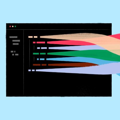
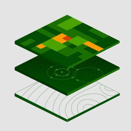
Establishing Truera as an industry leader was a key objective in the design of the website. And, Truera knew that they needed to differentiate themselves well in a crowded market. Without having the product designed and developed with real-world screens to display, we knew that it was vital to provide visual insights into what a future user would be seeing. We developed a series of illustrations modeled off the work-in-progress product, then continued with illustrations to signify concepts like ‘model quality’ and ‘trust.’
The other key priorities of the site were driving users to get a demo — so the Truera team could more readily show their capabilities — and providing a scalable area for resources and blogs where Truera’s team could validate their stance at the head of the model intelligence community through academic research, regulatory papers, case studies, data sheets, and more. The minimalistic design style allows the company’s research and expertise to lead the charge.


